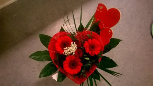
Day Eleven: A Pop of Color
The colors in our photographs are evocative and rouse emotions within us. Color can elevate a mundane image into something intriguing and meaningful, and can tell a particular story within the frame. Today, pay attention to how color affects your images. Experiment with one color, and think about how to feature it prominently.
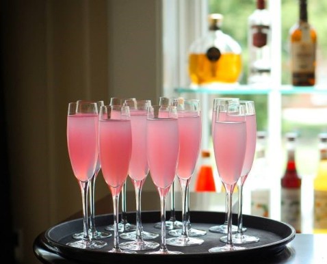
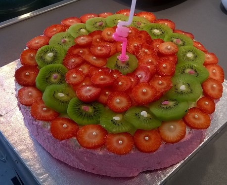
Don’t ignore soft, pastel shades — colors like mint and pink can make statements, too.
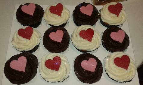
Juxtapose pastels with black and darker shades.
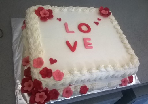
When in doubt, pair an accent color with white — you’ll see its impact immediately.
Copyright © 2016 by Simpledimple. All rights reserved.

Impressive concept…
LikeLiked by 1 person
Thank you! 🙂
LikeLike
You must be enjoying this course.
LikeLike
Yes. There’s so much for me to learn in photography and I am enjoying the experience.
LikeLiked by 1 person
Good work ! I only managed one and that was from the archive!
LikeLiked by 1 person
Hi Lindy, Mine was also from the archives. Thank you for stopping by. 🙂
LikeLike
Woah, they all pop!
LikeLiked by 1 person
Thanks Vicky. 🙂
LikeLike
love the picture of the pink champagne!
LikeLiked by 1 person
Thank you! 🙂
LikeLike
Lovely display 🙂
LikeLiked by 1 person
Thank you. 🙂
LikeLiked by 1 person
I can see you are using the rule of thirds in your photos, nice work.
LikeLiked by 1 person
Thank you. 🙂
LikeLiked by 1 person
The sharpness of the pink glasses in front of the blurred background really makes that photo pop. I really like that one!
LikeLiked by 1 person
Glad you liked that one. Thanks Christine. 🙂
LikeLike
So So nice! The photographer strikes again! 🙂
LikeLiked by 1 person
Haha! I want more than ever to learn more about photography so I can have a certain level of skills. I am clueless with the intricacies involved with captures and image angles… I love taking photos. I mean just clicking away with the camera. This course has become a useful resource that will redefine my perspectives in future captures.
LikeLiked by 1 person
Beautiful. I should take this class! I love the pink glasses.. so so pretty. Nice blog, great blogging.
LikeLiked by 1 person
Awww… Thanks so much Enny! I am glad you like my blog and the photos shared. Blessings to you. 🙂
LikeLiked by 1 person
I love the photo of pink champagne!
LikeLiked by 1 person
Thank you Novi. Love it too. 🙂
LikeLiked by 1 person
Fabulous! Looking forward to sharing with you!
LikeLiked by 1 person
Thanks a ton, Mo for coming on board. I appreciate. Hope to connect with you through your blog posts. Cheers! 🙂
LikeLike